Pixbrand Team
Published: 05/11/2024
However, errors are a part of everyday duties, and these mistakes do happen. What’s important to note is that the UI/UX mistakes affecting SEO are plenty, and this can be detrimental to your business in the long run.
In this blog, we will share 5 such mistakes that are hurting your site’s Search Engine Optimization (SEO) that you might not be aware of, and what you can do to avoid them.
Common SEO Mistakes in Design
A Cluttered User Interface
A user interface cluttered with multiple features or visual elements can be overwhelming for users. When there is too much information, users struggle to understand what they need to do, which leads to frustration and increased bounce rates.
You can avoid this mistake by choosing to stick with a minimalistic and clean design with an enhanced focus on usability. Also, make sure to use whitespaces more effectively to attract the attention of users.

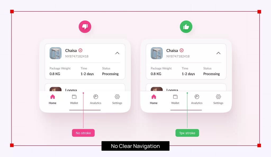
No Clear Navigation
As the timespan for attention contracts more than ever, the moment a user gets confused, they will leave your site, frustrated at the ‘slowness’ of it all. Add to it poor User Interface (UI) and User Experience (UX) play a crucial role when it comes to creating digital solutions that don’t just look appealing, but also leave no stone unturned in ensuring optimum functionality.
Navigation paths and hidden menus and sub-menus, and you will confuse your visitors even more.
You can take care of this by creating an intuitive website navigation, allowing users to move through your site with ease. It’s one of the best SEO practices for UX, and keeping the interface simple and logical with sticky keys, breadcrumbs and labels is going to be a lot of help.
Neglecting Mobile Responsiveness
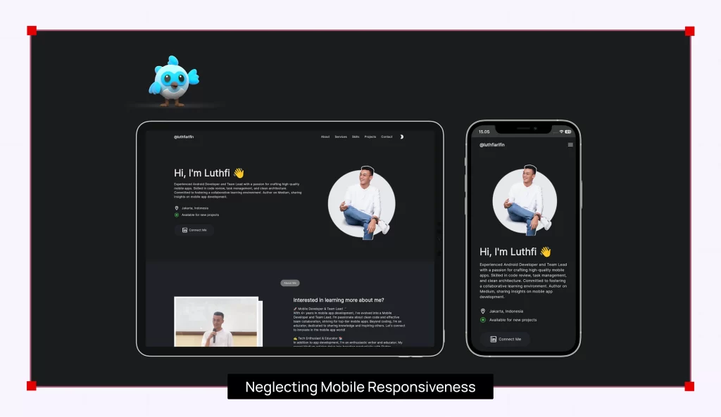
If you are not designing for mobiles, you are missing a big trick. A huge 4.88 billion people have smartphones, which means that not optimizing for them will make you miss out on a lot of potential clients. An unresponsive design for smaller screens can render your offerings of less or no use, making visitors leave your site.
A mobile-first approach is key. What you can do is begin your design process with the smallest screens first, and then proceed further. With this, you can ensure that all the text and icons are easily readable and functional across multiple devices.
Ignoring Accessibility
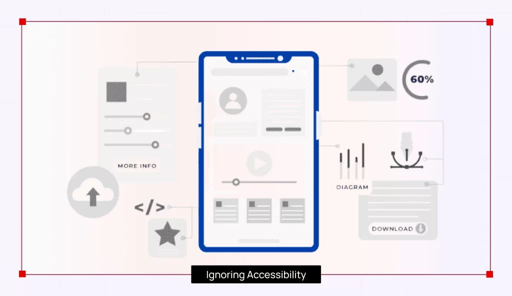
There might be a chunk of users who have certain disabilities, which could make it tough for them to interact with your offerings. Ignoring considerations when it comes to accessibility can prove to be a big mistake.
With the WCAG guidelines, you can create the UI/UX while being mindful of the accessibility factor for users. Adding text for images, offering keyboard navigation, and ensuring that all interactive elements are accessible to users will keep all accessibility issues at bay.
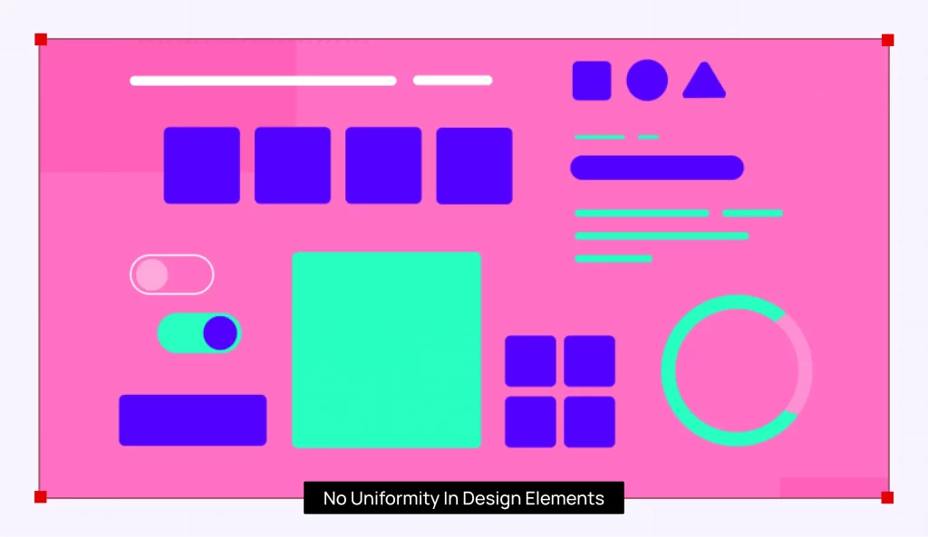
No Uniformity in Design Elements
Inconsistency in colors, fonts, or different buttons across your product can confuse the users and give them an impression of a product that isn’t serious. Consistency is crucial when it comes to a seamless user experience.
A style guide is one of the best ways to ensure consistency. Typography, colors, and button styles need to be kept consistent across the length and breadth of the interface. It creates a professional and comprehensive experience for all users.
Conclusion
Making errors in design is all part of the overall process, but at the same time, it’s also important to remember that nothing is inevitable. While making these mistakes is one thing, what is recommended is ensuring that these mistakes don’t take away the potential your offerings have.
If you feel that you are all set to take your business to the next (digital) level, then Pix Brand can offer you the right digital brand identity that is impactful, and will bring you the results you expect. Reach out us for more such informative content.